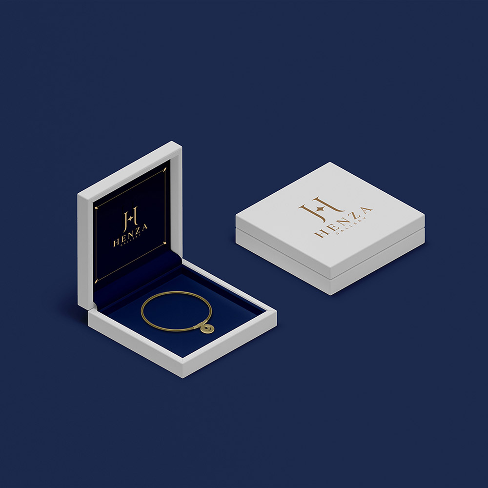
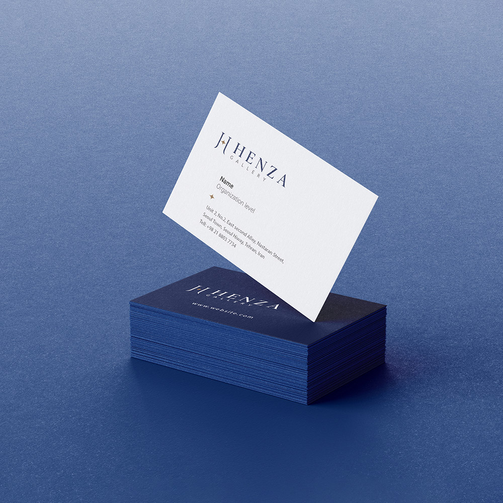
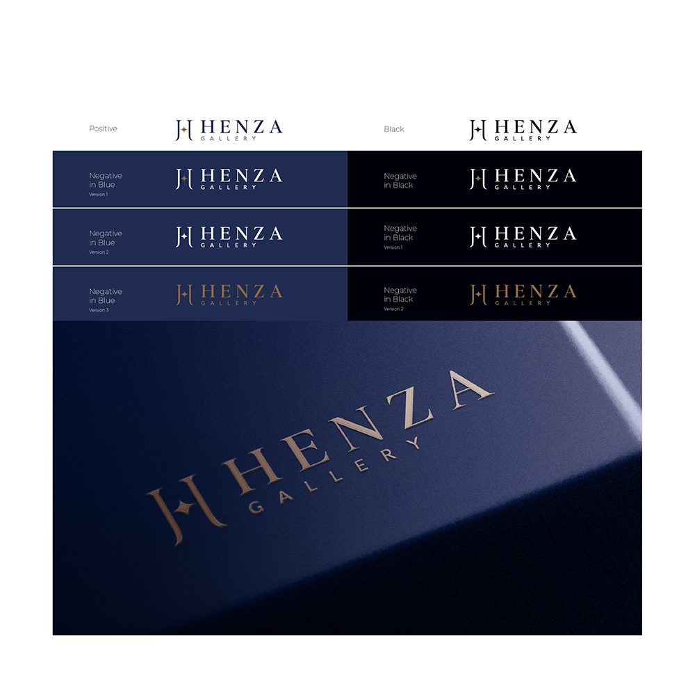
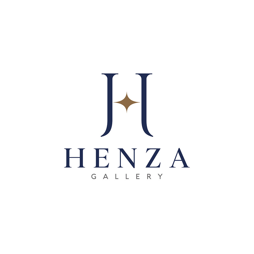
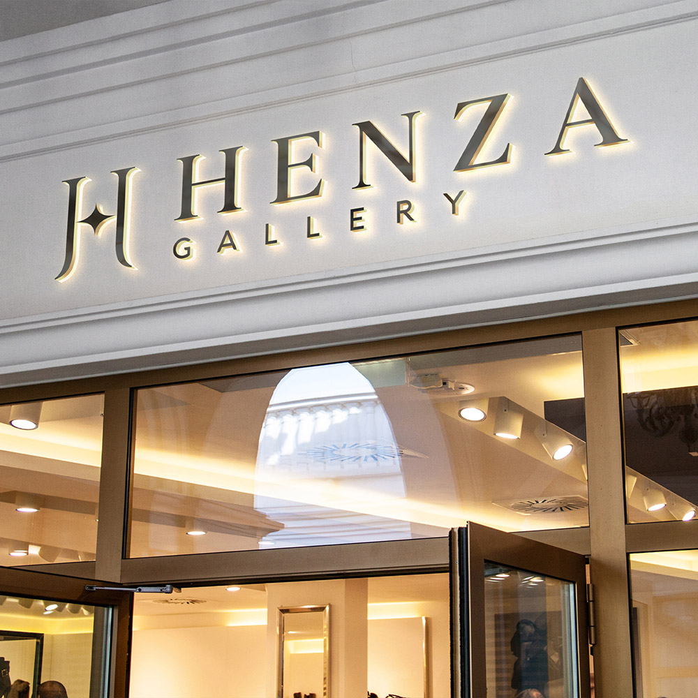
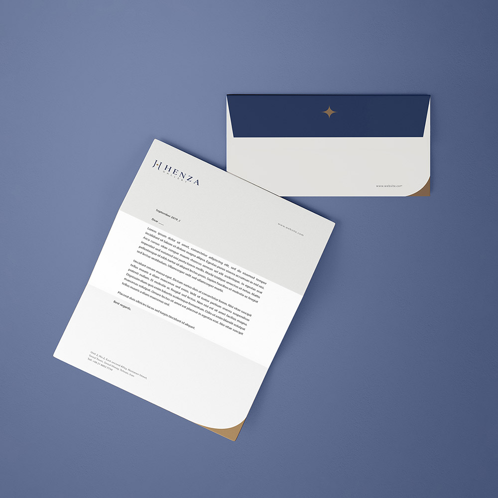
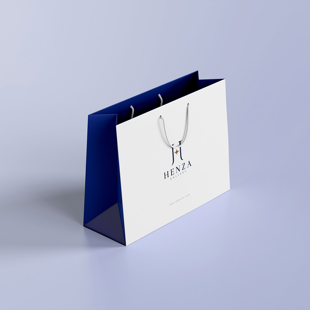
An old banker in the jewelry market, who had many years of experience in B2B sales to goldsmiths, wanted to create a new brand for B2C customers. This new brand faced challenges to enter the gold market and had to answer the following questions: How can you design products with a reasonable price and weight, and at the same time eye-catching? What kind of identity should it have in the gold market with strong and old competitors for young and teenage audiences to stand out? The solution was to create an identity to represent the discovery of the new experience and provide plans to enter the daily life of customers. The visual identity of Henza brand was designed and implemented based on the brand strategy that emphasized elements such as discovery, attractiveness and trust. The uniqueness of Hanza products is one of the key values of this brand. Also, the fact that the brand should look completely modern was one of the key points of the design brief for the visual identity of the brand. In this regard, with the combination of the letter H derived from the brand name and the star to evoke the uniqueness of the products, various designs were proposed, which was chosen and implemented in a more attractive and coherent form. Navy color was used to evoke attractiveness and sense of trust, and golden color was used to evoke brightness and discovery in the visual identity. In order to implement various brand touchpoints, a pattern with a suitable brand association was also designed, which was used in items such as envelopes, packaging wrappers, ribbons, etc.
by THE Branding Agency, 2021 Consultant and strategist: Dr. Farzad Moghaddam Project Manager and brand strategist: Mojtaba Kheradyar Art Director and Logo Redesign: Mojtaba Hassanpour Visual Guideline Designer: Mojtaba Hassanpour Visual Guideline Compilation: Faezeh Noroozi

