The subject of this project is the design of mental identity and visual identity for chain hotels that already have an international brand.
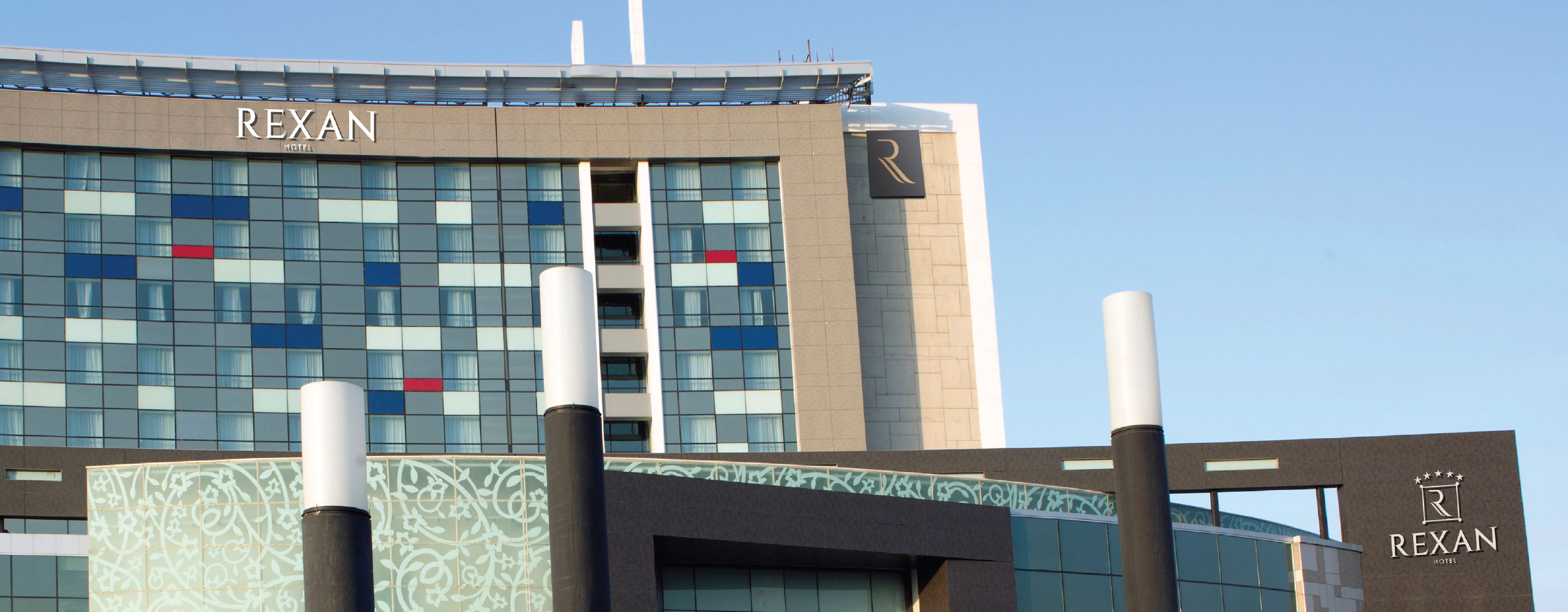
Accor and Novotel brands were forced to remove their brands from airport hotels due to Iranian sanctions. It was necessary to design a suitable brand in the stature of global hotels for this complex.
With the research that was conducted on the target audience, it was found that from the point of view of Iranian and Middle Eastern travelers, hotel brands that have a clear identity in terms of behavior and have the ability to predict services are more reliable and desirable hotels. For this reason, the code of conduct of hotel employees and services was designed and provided to the hotel.
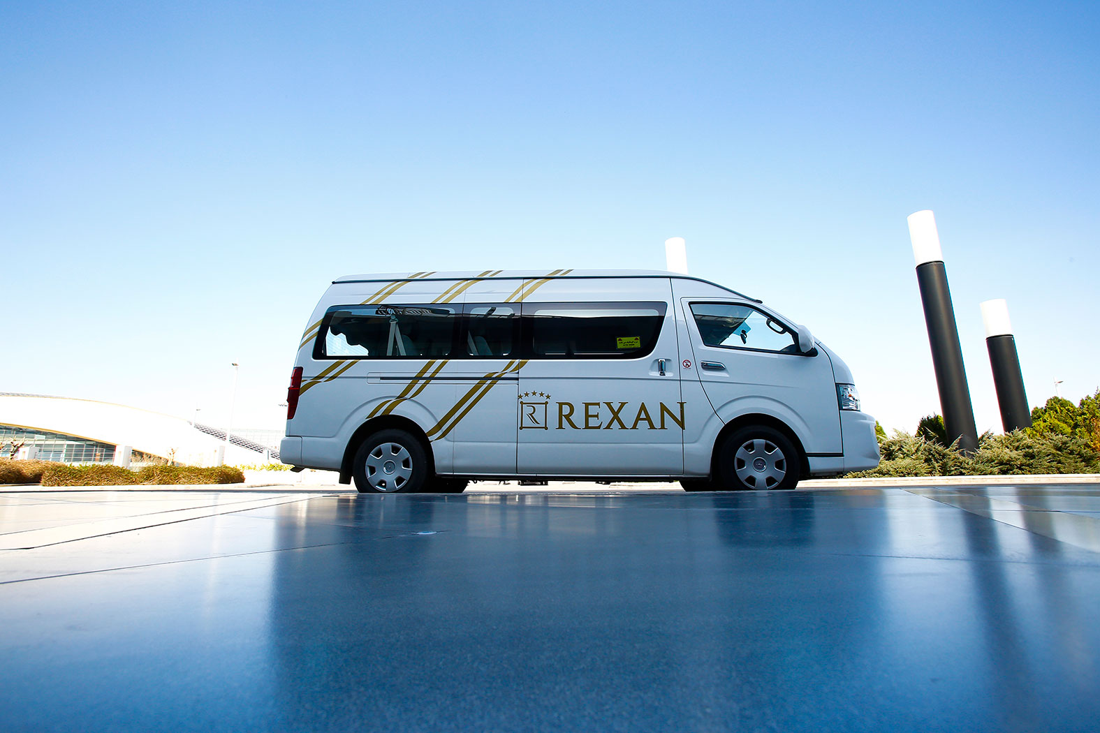
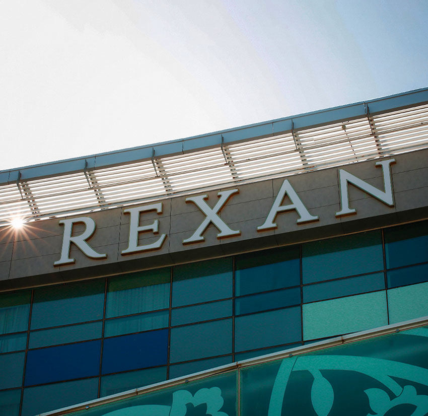
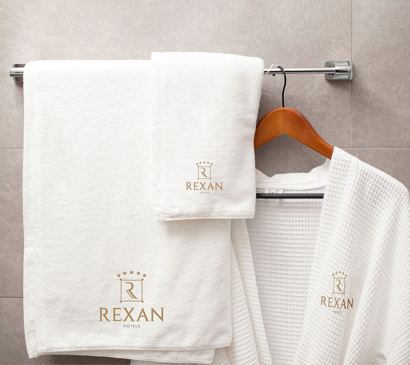
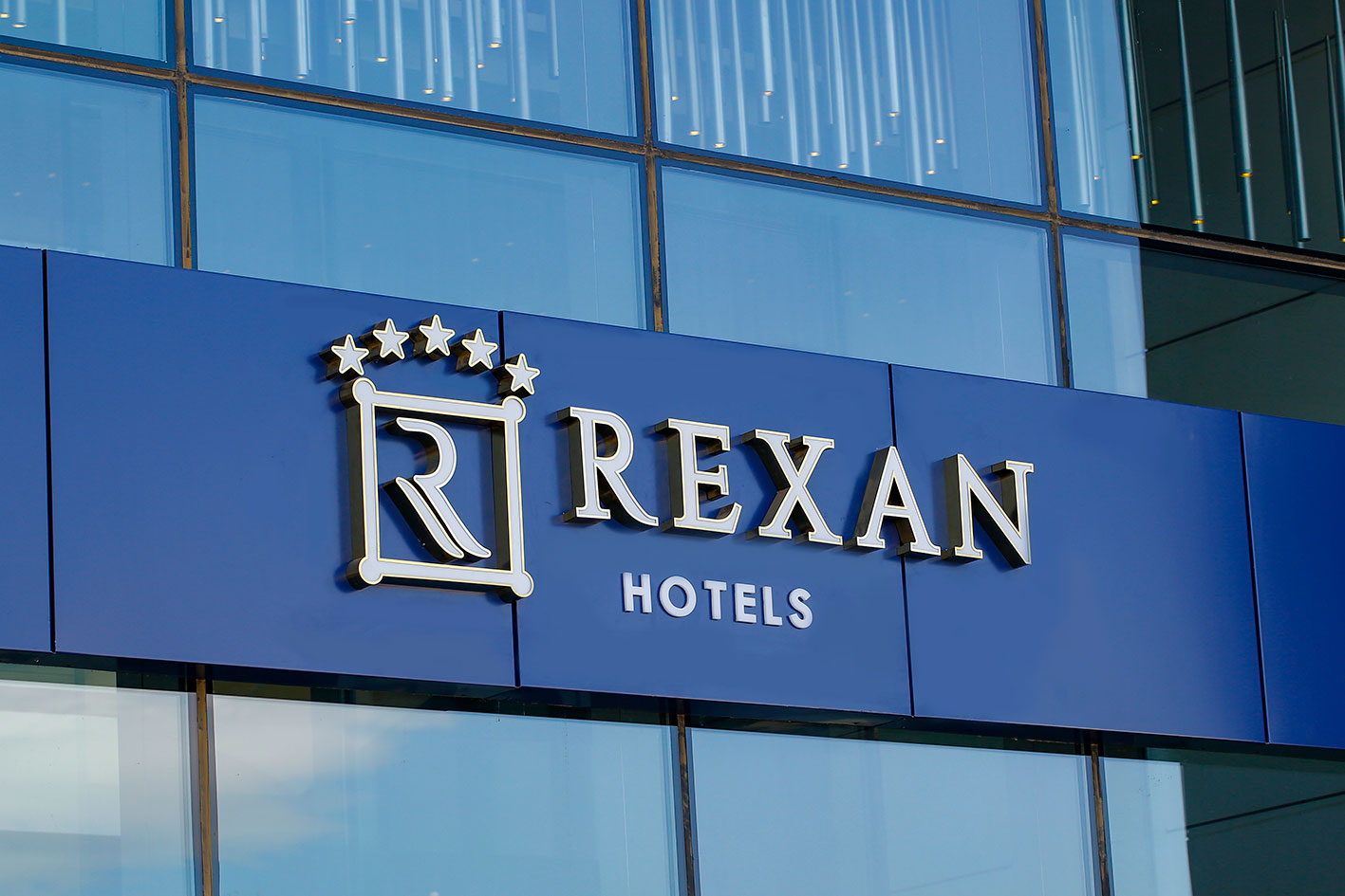
In the naming project of “Rexan International Hotels Group”, research showed that the presence of the letters R and X in the name of the hotel gives more favor to the audience. For this reason, the name Rexan was designed by combining the two words IRAN and RELAX with the Fabricated naming method.
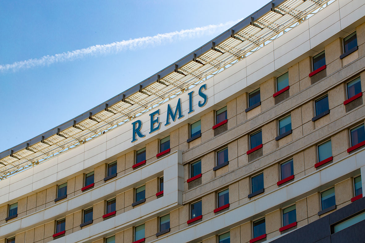
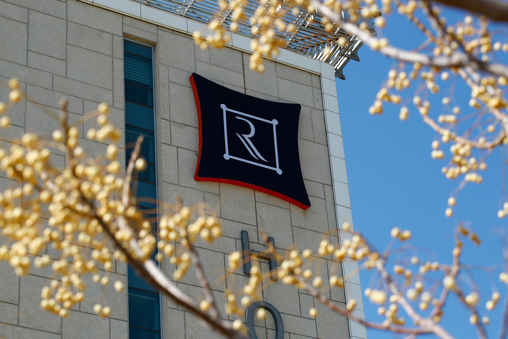
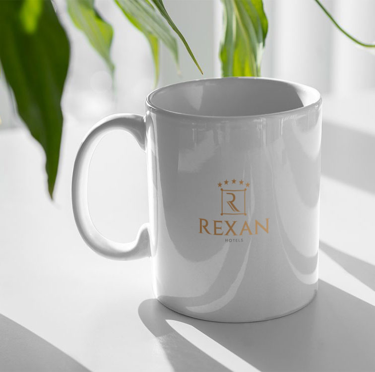
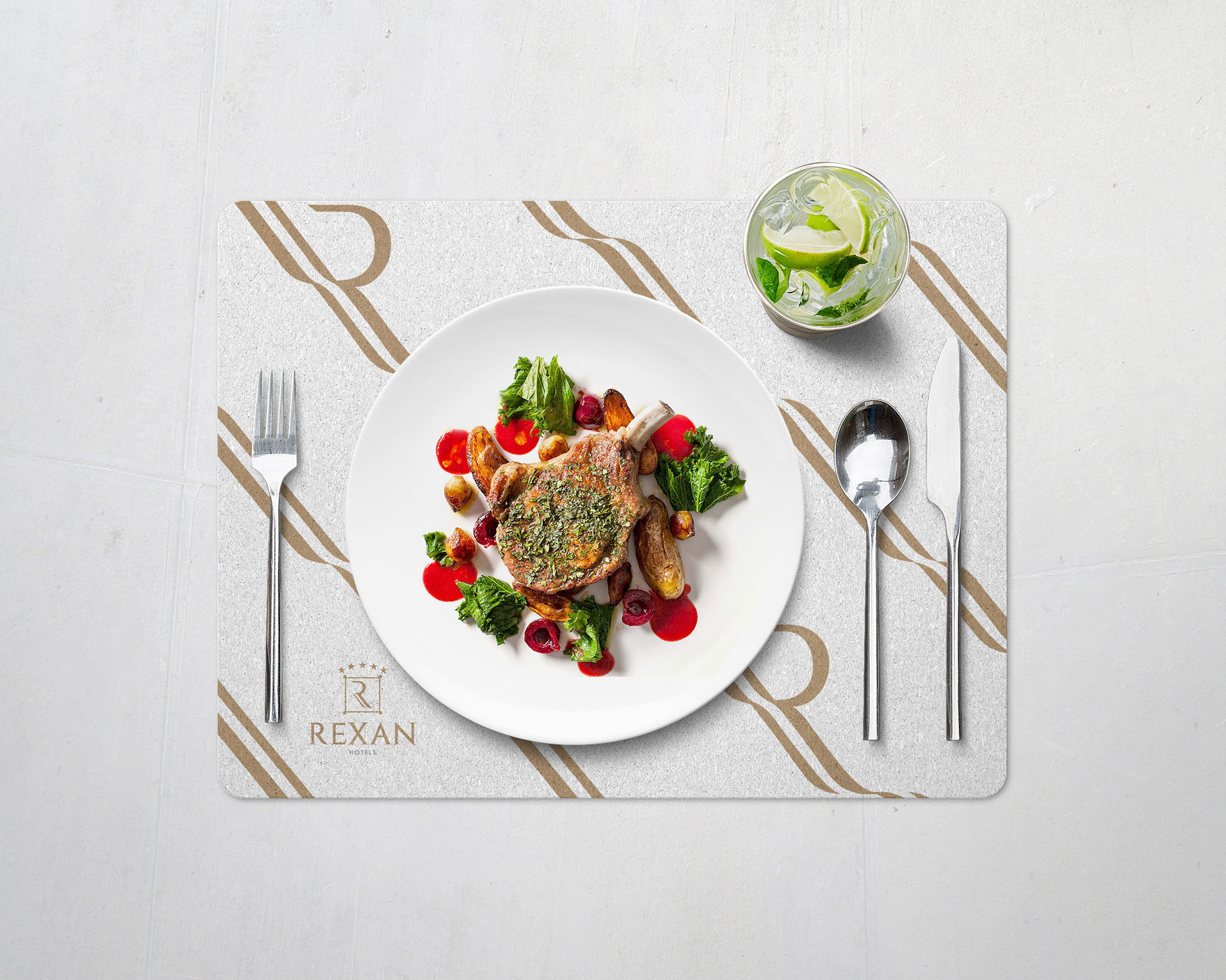
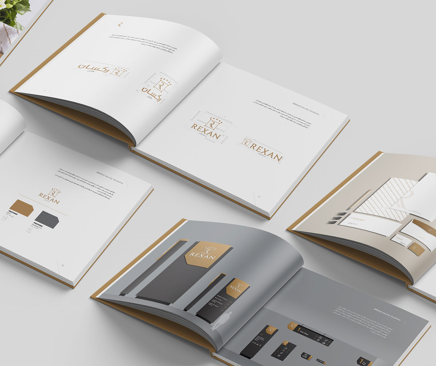
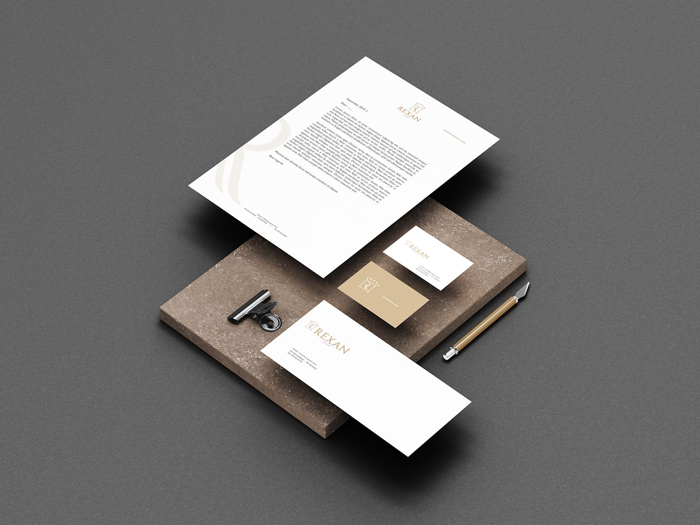
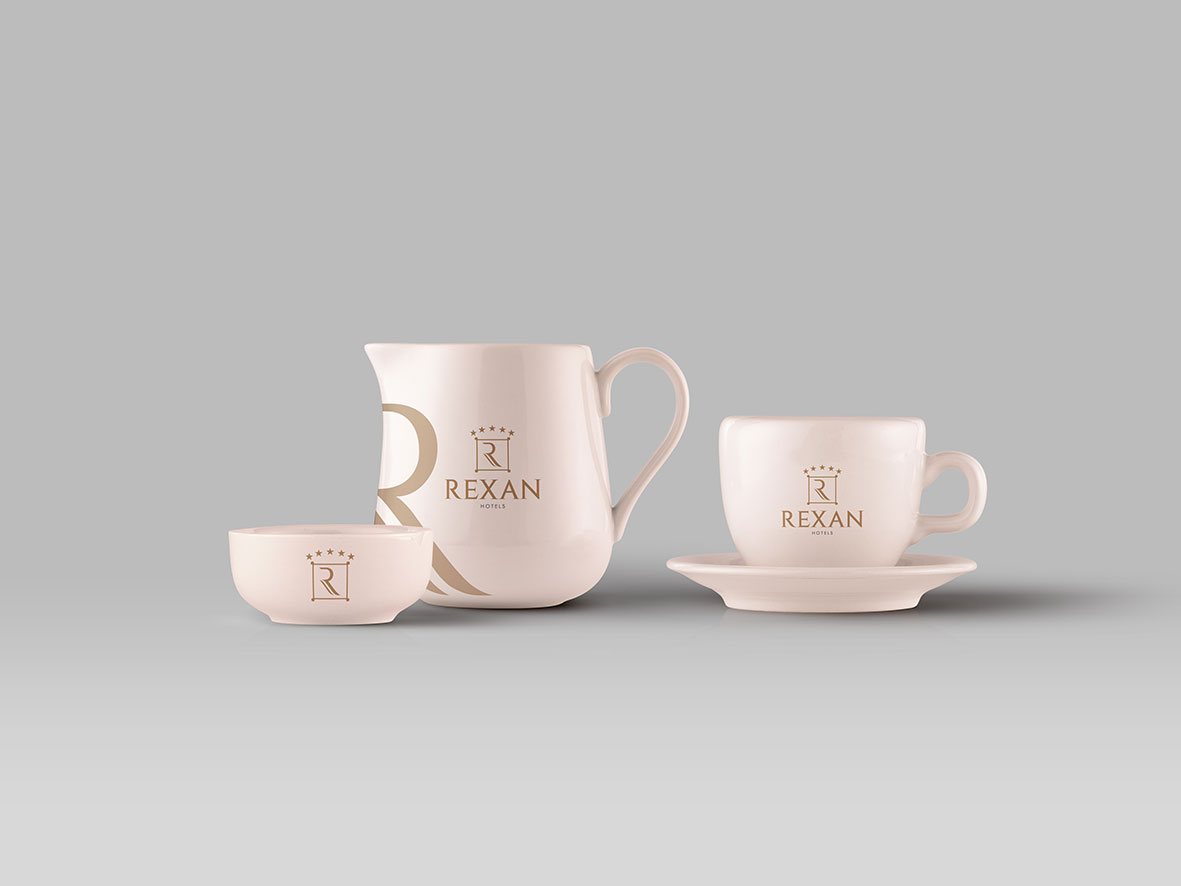
The logo design of Rexan five-star hotels is derived from the architectural plan of Iranian caravanserais with four towers around them. This format is repeated in the logos of the four-star Remis hotels and Karvanica boutique hotels in order to establish greater harmony between the hotel groups. The golden color of the five-star Rexan hotel logo was chosen to evoke luxury and create a special and distinct feeling. The R format can be repeated in different spaces, and its lower part is used to create a brand pattern and repeat the soft and relaxing form.
by THE Branding Agency, 2020
Consultant and strategist: Dr. Farzad Moghaddam
Art Director and Logo Redesign: Mojtaba Hassanpour

